
Brand
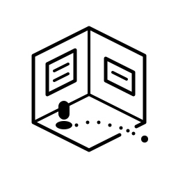
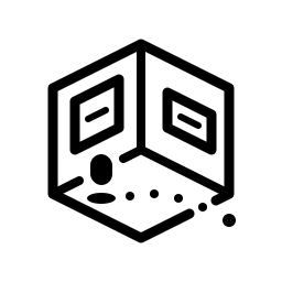
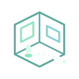
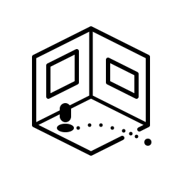
The Hyprune mark is a single room drawn on a 2:1 isometric grid. It has one opening, and a route of footsteps leads from the player through it. It is a place to work and a way out to explore. The H monogram carries the same angles, rounded ends and dipped floor at sizes too small for the room. All artwork is original vector drawing, with no fonts or raster images, by Hyprune contributors. Use these files unmodified when referring to Hyprune.
Primary mark
Section titled “Primary mark”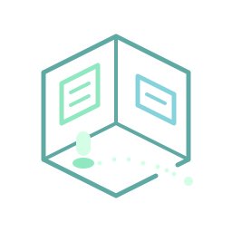


Monogram
Section titled “Monogram”


At exactly 16 px use the separate 16-unit drawing with 2 px stems; from 17 to 47 px use the 32-unit master.
Lockups
Section titled “Lockups”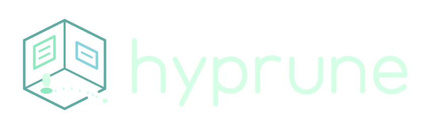

The wordmark is custom lettering drawn as paths. Its baseline meets the player’s ground line, with a 48-unit gap between mark and lettering. Don’t retype it in a font.
Colours
Section titled “Colours”| Role | On navy #0F1A27 |
Contrast | On paper #F3F7F3 |
Contrast |
|---|---|---|---|---|
| Architecture | #5FA9A4 |
6.43:1 | #456C6C |
5.37:1 |
| Window, mint | #8FE8BF |
12.08:1 | #287567 |
5.07:1 |
| Window, cyan | #86D3DC |
10.33:1 | #2B7182 |
5.13:1 |
| Player and lettering | #D4FFE6 |
16.07:1 | #0F1A27 |
16.21:1 |
Each stroke colour keeps at least 5:1 contrast on its paired background, and the light set also exceeds 5:1 on white. Mono files use currentColor; inline them or use them as a CSS mask to take the surrounding text colour.
Clear space and minimum sizes
Section titled “Clear space and minimum sizes”Keep clear space of 2x around the visible ink, where x is the player’s width (16 units). That is 32 units beyond the outermost stroke. The app tiles and favicon already include their padding.
| Asset | Use at |
|---|---|
| Primary mark (full room) | 96 px and larger |
| Optical room | 48–95 px |
| H monogram | 16–47 px (16-unit drawing at exactly 16 px) |
| Colour lockup | 336 px wide and larger |
| Bold mark | 64 px and larger (optical bold: 32–63 px) |
| Bold horizontal lockup | 240 px wide and larger (small variant: 160–239 px) |
| Bold stacked lockup | 160 px wide and larger |
Do and don’t
Section titled “Do and don’t”- Do use the paired palette: the navy set on dark backgrounds, the paper set on light ones.
- Do keep the single opening in the room, and keep the player left of centre.
- Do use one ink with no background knockouts for single-colour use, and the bold weight next to the wordmark.
- Do place watermarks over a calm area of a capture, away from text. Use opaque ink or a plate when the mark must carry information.
- Don’t shrink the full room below its minimum. Switch to the optical room or the H.
- Don’t stretch, mirror, rotate, recolour, outline or add glow or shadows.
- Don’t re-centre the player, close the opening, or add a second opening.
Downloads
Section titled “Downloads”All files are transparent SVG unless noted.
| Asset | Colour (dark / light) | One ink |
|---|---|---|
| Primary mark | dark · light | mono · bold |
| Optical room | dark · light | mono · bold |
| H monogram, 32 | dark · light | mono |
| H monogram, 16 | dark · light | mono |
| Lockup | dark · light · panels dark / light | mono · bold horizontal / small / stacked |
| App tiles | primary dark / light · optical dark / light | |
| Web icons | favicon.svg · favicon.ico (16/32/48) · apple-touch-icon.png (180 px) · source |